
4
8
Lightspeed
OVERVIEW
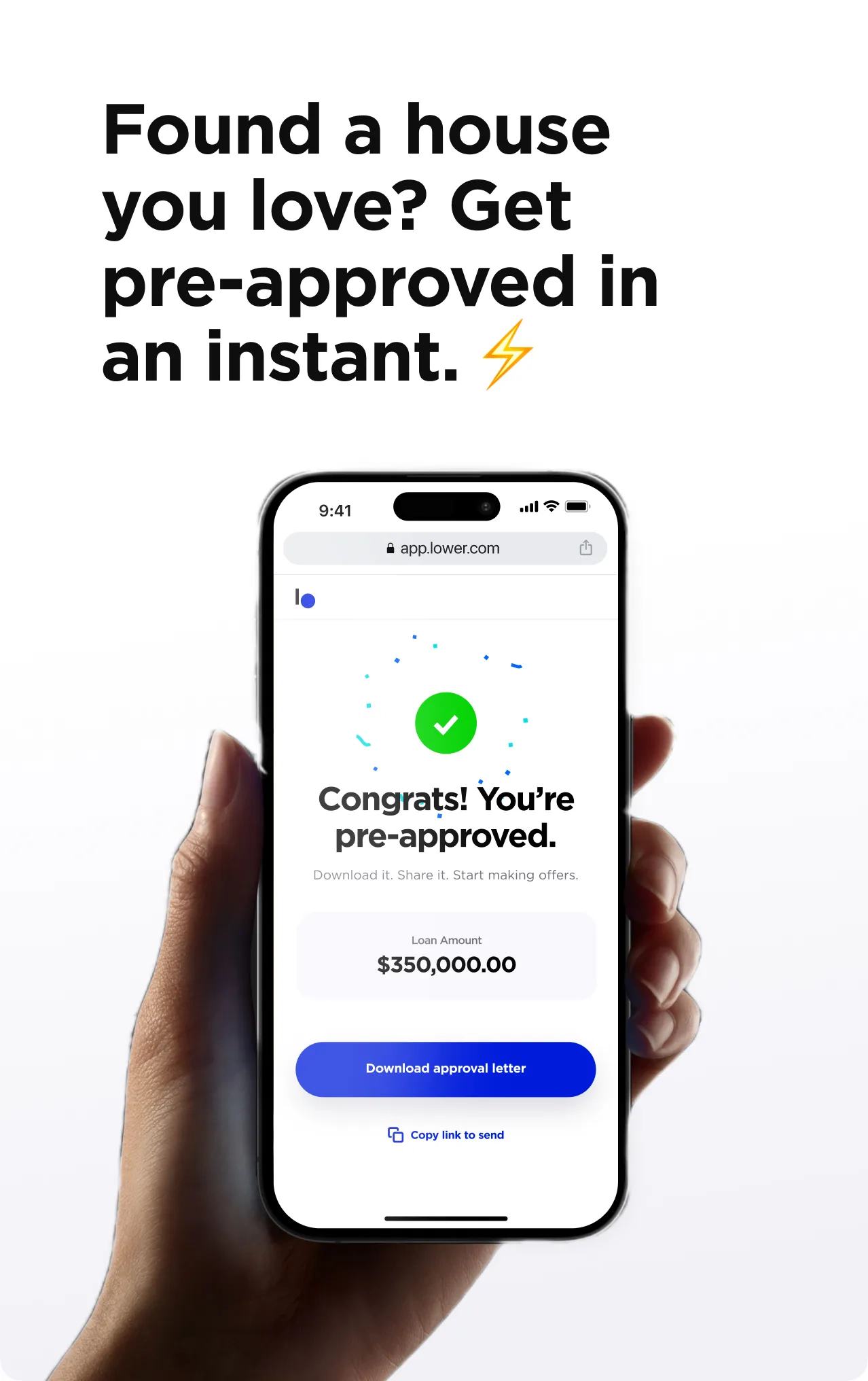
An application with real-time rates. Customers can get a personalized rate with just a few quick taps on their phone. Even before speaking with a loan advisor, this user has more buy-in, and is ready to go.
WHAT I WORKED ON–
Product strategy, User experience, User interface
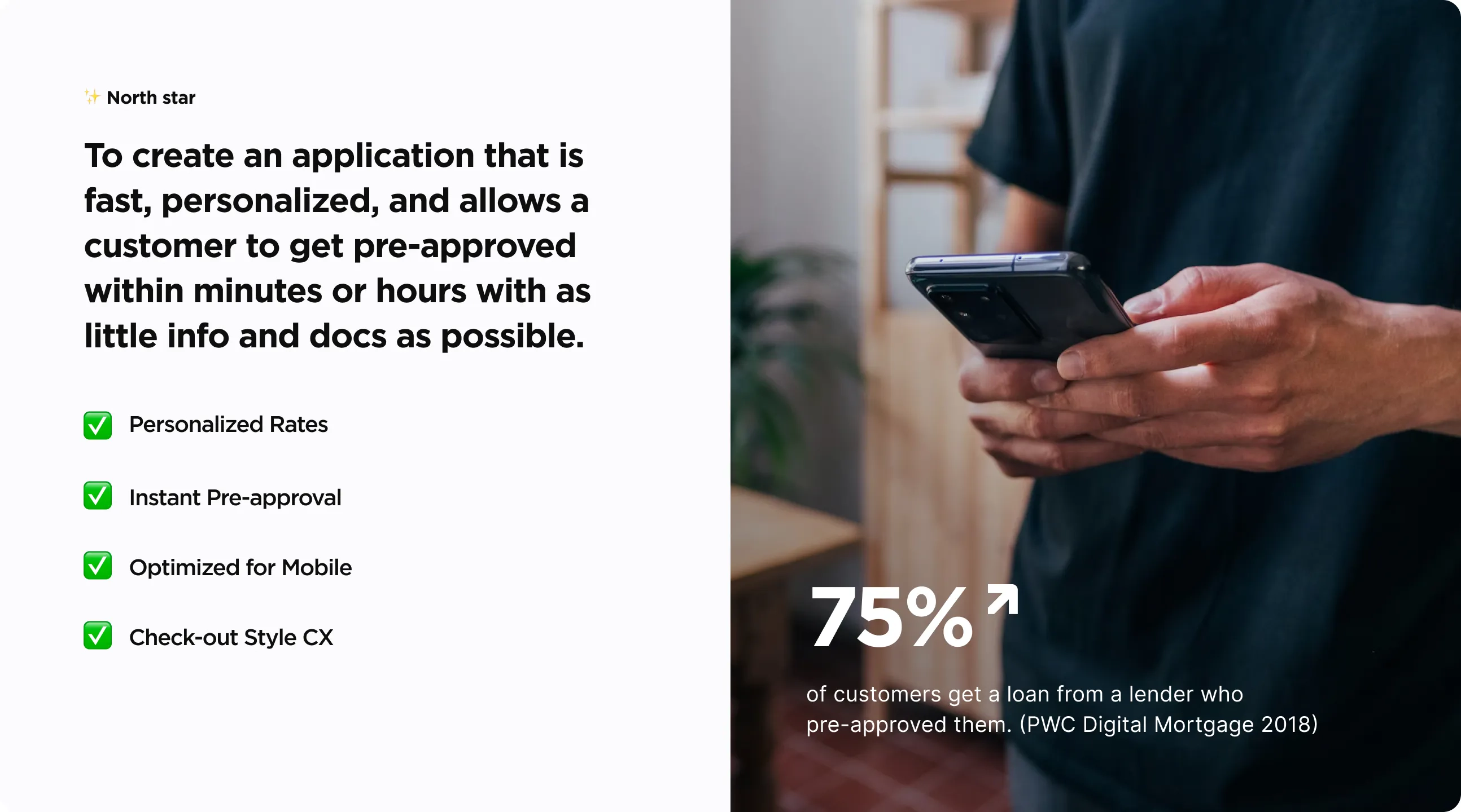
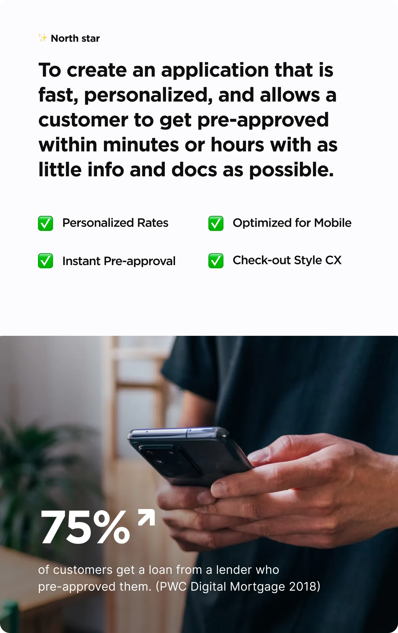
THE CHALLENGE
A mortgage is often the biggest transaction for people and it’s often frustrating and long. We saw this as an opportunity to build an experience customer’s were looking for:
56% of Lower.com web traffic is on mobile, and we needed an experience built for it.
85% of homeowners reported preferring pre-filled information on their home insurance application. (LexisNexis 2018)
More than 75% of customers get a loan from a lender who pre-approved them. (PWC Digital Mortgage 2018)
Getting pre-approved within 24hours has been listed as a top CX improvement requested by first-time homebuyers. (McKinsey 2018)
THE APPROACH
No more 25+ questions. Just a few quick taps on their phone. We refined the traditional mortgage application to gather enough data to provide a real-time rate.
This took alignment and research across multiple teams (sales, processing, product, engineering, and brand) to make the secret sauce: knowing when tech and automation can simplify and when the personal touch of an expert is needed to convert.


BEHIND THE SCENES 👀
My process is one that is iterative and focused. I work with stakeholders to identify key elements that help become visual guides to ensure the outcome is successful. This starts with research, ideation, and defining key screens within a user flow.
To guide the project, I established several critical keywords and phrases such as "tap to buy," "frictionless," and "product-focused" These core concepts informed the visual direction and ensured timely delivery of the project while also guarding against the influence of stakeholder bias. The visuals were intentionally aligned with these key terms to achieve the desired outcome.


MVP 🚀
During our exploration I explored features like license scan, instant rate lock w/ payment, and custom bank and payroll login flows to build a mortgage application that could go beyond pre-approval.
After scoping and reviewing the product vision with our engineering team and stakeholders I worked collaboratively to deliver a product that met our original north star:
Instead of license scan, we chose to launch with form fields with pre-fill capabilities to accomplish a similar effect.
Instead of processing payments and rate-lock we focused just on what was need for pre-approval: verification of funds and employment verification.
To get to market faster, we leveraged Plaid’s out-of-the-box flow and focused on running employment verification in the background so the user doesn’t have to lift a finger.


TAP. SWIPE. Approved. ✅
Easy-to-navigate screens with interactive elements to make it feel light and fast. These simple key screens allow qualified borrowers to move effortlessly through the experience. They also provide enough information for our advisors to have an informed conversation with a potential customer allowing them to convert more leads.


Everybody wins.
Prospective homeowners are able to obtain pre-approval in a shorter timeframe, empowering them to make informed decisions when purchasing a home. Simultaneously, our sales team benefits from more precise data, which enables them to recommend the most suitable loan product to our clients. It is truly a win-win situation.


"
Lower helped us get our pre-approval quickly and easily. They made the process super simple for us. We’re excited to close on our first home!”
Lower.com Customer Review
